The Qaoki brand, in one place.
Everything you need to represent Qaoki accurately — the logo and its variants, our colours and type, the voice we write in, and what the mark actually means. Grab the assets below; if something’s missing, email [email protected].
Real-time karaoke, in sync.
Qaoki turns any karaoke night into a shared, live show. One real-time queue per room, lyrics synced to the big screen on every phone, and a crowd that cheers you on while you sing. No clipboard, no binder, no one hogging the aux cable — just grab the mic and the whole room singswith you. Free to sing, opt-in if you want to be filmed, and on iOS, Android, and the web.
Qaoki is a product by2 Lovelaces — a nod to Ada Lovelace, the first computer programmer. We build products, not just apps: technical partners who ship, test rigorously, and stick around to scale past “day 100”.
The lockup.
The full lockup is the mark — a speech-balloon “Q” cradling the queue glyph — beside the Qaoki wordmark. Prefer it wherever it fits. Reach for the standalone mark only when space is tight.
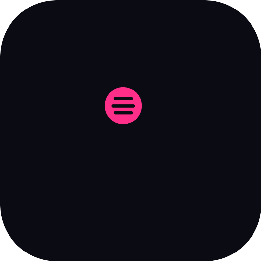
One glyph, two ideas.
The outer shape is a speech balloon — the room talking back, the cheers, the sing-along. Inside sits the queue: the running list every phone shares. Conversation plus order. That’s Qaoki in a single mark.


Give it room.
Keep clear space around the logo equal to the height of the mark’s inner counter on every side. Don’t crowd it with text or other logos.
- Minimum mark size: 20 px on screen, 8 mm in print.
- SVG is the master — scale it freely, never upscale a PNG.
- On photos, use the mono white or mono black lockup.
Please never…
- Recolour the mark or wordmark outside the approved palette.
- Stretch, squash, rotate, or skew the logo.
- Add drop shadows, glows, gradients, or outlines.
- Place the magenta logo on a low-contrast or clashing background.
- Rebuild or re-letter the wordmark — always use the supplied files.
- Box the logo in unless clear space can’t otherwise be guaranteed.
Magenta leads. Violet cheers.
Magenta is the signal — the mark, the buttons, the links. Violet is reserved for the social layer: cheers, favourites, the people you follow. Ink and blush carry everything else. Tap a swatch to copy.
Two voices.
Plus Jakarta Sans does the talking — on the web and inside the app alike — while Space Grotesk handles the labels. Both are free on Google Fonts.
Real-time karaoke, in sync.
ONE QUEUE · EVERY PHONE
How Qaoki talks.
- Warm, never corporate. We’re hyping up the room, not pitching a board.
- Plain and concrete. “Grab the mic,” not “leverage the experience.”
- Confident about the tech, quiet about it. The sync just works; we don’t lecture on how.
- Inclusive and a little playful. Karaoke is for everyone — the writing should feel like it.
Writing “Qaoki”.
- One word, capital Q, rest lowercase: Qaoki.
- Never “QAOKI”, “qaoki”, or “Q-aoki” in running text.
- It’s a product by 2 Lovelaces — credit the maker on first mention where it helps.
- Tagline: Real-time karaoke, in sync.
Take the whole kit.
Logos, marks, app icon, palette, and these guidelines — zipped and ready. Questions or partnership requests:[email protected].